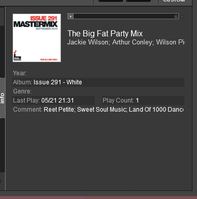
Is there any chance of making the Comment Field larger when using the Info Box (bottom right hand corner of screen). Yes, I know the comment scrolls in the Browser but it would be much easier to see the complete Comment in the Info Box, especially when looking at detailed info for specific mixes.
(Apologies if anyone else has already asked - not always easy to find things as so many posts)
(Apologies if anyone else has already asked - not always easy to find things as so many posts)
geposted Sat 17 May 14 @ 4:44 am
Just wondering if anyone else would find this useful? Really would be easier to see all the songs listed in a particular mix.
geposted Thu 22 May 14 @ 5:31 am
I use the comment field regularly. Some skins have the comment show
up near the title or somewhere near the platters, like Mixlab 3.1.
Unfortunately Mixlab is not updated for vesion 8.
I would Like to see the comment field show like in Version 7 on some of the skins.
up near the title or somewhere near the platters, like Mixlab 3.1.
Unfortunately Mixlab is not updated for vesion 8.
I would Like to see the comment field show like in Version 7 on some of the skins.
geposted Thu 22 May 14 @ 7:07 am
@DanCatt
not sure i understand, but you can drag the info side view out to view larger, if you want to see more of the comment (without a scroll), to see full comment, either temporary or for keeps (depends on how long comments you use..)
not sure i understand, but you can drag the info side view out to view larger, if you want to see more of the comment (without a scroll), to see full comment, either temporary or for keeps (depends on how long comments you use..)
geposted Thu 22 May 14 @ 7:09 am
How about a comment popup? The ability to open the comment in its own floating resizable window. Then people can even put it on a 2nd screen.
geposted Thu 22 May 14 @ 7:12 am
Ooh, I like that!
geposted Thu 22 May 14 @ 7:44 am
Even if it was the info area that did it....
Just select what you want to see (could be just comments) then be able undock it like the effects windows and move it/resize it.
While you're at it, add the resize option back to the effects as well. :-)
Just select what you want to see (could be just comments) then be able undock it like the effects windows and move it/resize it.
While you're at it, add the resize option back to the effects as well. :-)
geposted Thu 22 May 14 @ 8:21 am

If you look at the Comment field - the way I have mine set, there is loads of room underneath it, but as it is only just a text field probably in the HTML, it is only 1 line. If the box was bigger, perhaps set as a Memo Field, then the whole of the text could be read in one go.
Hope that makes more sense now.
geposted Thu 22 May 14 @ 4:12 pm
Say DanCatt
Do ALL your COMMENTS appear OK.
A lot of my comments are CHOPPED OFF (half visible on Line).
It Doesn't matter what the LENGTH is (Short or Long comments).
Thanks
Jose
Do ALL your COMMENTS appear OK.
A lot of my comments are CHOPPED OFF (half visible on Line).
It Doesn't matter what the LENGTH is (Short or Long comments).
Thanks
Jose
geposted Thu 22 May 14 @ 9:49 pm
Not sure how your Library is built, but the Info you have in your Comment field could be split to various other fields such as Genre, Album, field 1, field 2 , Remix, Remixer, Composer etc, I find the comment field indeed useful, but only to add info there that are not related to any other field.
geposted Thu 22 May 14 @ 10:06 pm
djdad
It just contains information (original artist of song, location of artist, etc and not tied to any other field).
Thanks
Jose
It just contains information (original artist of song, location of artist, etc and not tied to any other field).
Thanks
Jose
geposted Thu 22 May 14 @ 10:59 pm
I use the Comment Field for details of songs/artists in a mix, e.g. some mixes from Mastermix or DMC will have a specific title so the Song Title would read Big Fat Party Mix - the Artists would go in the Artist field but the list of songs included in the mix, I would put in the Comment Field.
geposted Fri 23 May 14 @ 11:41 am
You can still use a keyboard shortcut to edit comment
edit_comment
edit_comment
geposted Sun 15 Jun 14 @ 5:27 pm
Just wondered if this may be added to the list for changing or if anyone knows if I could change the size of the Comment box by amending something in the skin XML file?
geposted Thu 26 Jun 14 @ 8:16 pm
I think what's required is for the comment box/area to allow use of returns/new lines, or to expand to a suitable size when there's lots of text entered.
At the moment, if there is a lot of text in the comment box (list of songs in a mix, or song lyrics etc.) then it can't all be seen at a glance.
As seen here, the comment field should fill the space intelligently (wrap) instead of being restricted to one line.

+1 from me
At the moment, if there is a lot of text in the comment box (list of songs in a mix, or song lyrics etc.) then it can't all be seen at a glance.
As seen here, the comment field should fill the space intelligently (wrap) instead of being restricted to one line.

+1 from me
geposted Fri 27 Jun 14 @ 5:45 am
Makes perfect sense ..........
+1 here too !
+1 here too !
geposted Fri 27 Jun 14 @ 7:49 am


