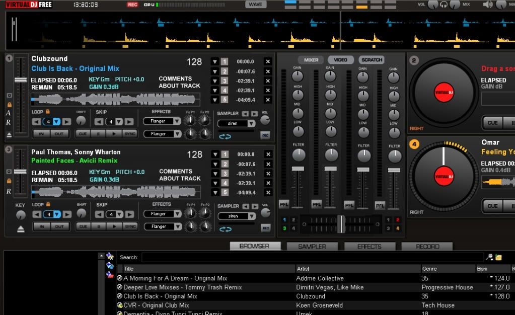
I play mainly EDM using a controller therefore i need a lot of visual feedback on certain elements that i cant get from the controller or that are just easier to see on a skin while generally dont need to click buttons on the skin for stuff like loops or cues. To that end i put together a mock up of what my idea of the most fitting skin would be for EDM controller DJs. I borrowed elements and ideas from other skins and crammed as much as could in the space i had while still trying to keep it clean and logically organized.
I have no need for a spinning platter hence i have done away with it in order to fit all the needed elements (effects, samples, loops, cues, beat skip). I have also stretched the mixer area to fit in a filter knob, longer VUs and volume faders and, added a REC button/indicator near the CPU meter.
Comparing left and right you can see the differences in deck and mixer size as compared to the original VDJ 4 deck skin.
There are also differences between the top and bottom deck since i wasnt sure how long i wanted the pitch faders to be. Also contemplating doing away with the loop shift knob and replacing it with the key changer knob.
Unfortunately i dont have the scripting skills to make this happen however, if someone is willing to work on that part I will happily do all the graphics.
If interested hit me up.

geposted Mon 10 Jan 11 @ 4:39 pm
Il be able to work this skin, but dont i need aproval from djinnorway for that? Since its a mod of the origianl 4 deck skin, we need permission from the creator. But i can do that skin, just to figure out how to send me the graphics wothout putting my email adress.
geposted Mon 10 Jan 11 @ 10:14 pm
You have to have permission to publish a variation on a creators skin. If you just want to make modifications to an existing skin for personal use you can do that. right?
geposted Tue 11 Jan 11 @ 3:14 am
I claim creation of this skin, but unless you want to distribute it, we dont really need permission from dj-in-norway. And post a link to the full picture in high quality so i can get to work. But i need to know what you want me to do for what knob and button and all that.
geposted Tue 11 Jan 11 @ 6:38 am
Well i rather we not spend all this time working on it to just keep it to ourselves so I will get in touch with norway and see if we can get permission for release.
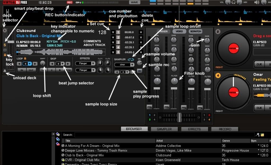
Below is the skin with button and knob labels. I have changed and added several elements from the first draft, I am also considering replacing the shift knob with a KEY knob. Obviously proportions will need to be reworked somewhat but the general idea is all there.
Also, keep in mind this is my first time working on a skin so I might have some questions at the beginning when doing graphics.
I can post the bmp file on a hosting site so emails wont be necessary.
[the image is resized, to get the full view just right click > view image]

geposted Tue 11 Jan 11 @ 10:22 am
Just put an image of just the skin. And for those buttons that u added (those that look a bit cheap that weren't originally in the default skin), put the graphics for when the mouse is hovering over them, when it presses the button, and when it is on, as a separate image, and then I will start my scripting magic.
geposted Tue 11 Jan 11 @ 2:29 pm
killadj4136 wrote :
Just put an image of just the skin. And for those buttons that u added (those that look a bit cheap that weren't originally in the default skin), put the graphics for when the mouse is hovering over them, when it presses the button, and when it is on, as a separate image, and then I will start my scripting magic.
Will do as soon as i get a few more opinions on it.
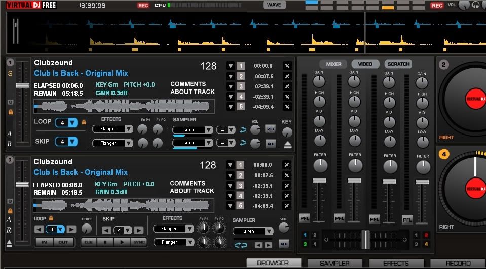
Im actually still mulling over different layouts. Here is the latest one i came up with (new deck layout top, old layout bottom).
Killa what do you think?
geposted Tue 11 Jan 11 @ 2:56 pm
i am assuming that the top and bottom decks are 2 possibilities for the layout of each deck, but i quite don't understand the wheels on the right. What do you want, to eliminate the wheels for the right decks? Anyway the bottom layout is way better. Post here the final image of the final layout you are doing. Also the buttons for the cues, they are not gonna be blank, i need graphics for when the mouse is hovering over them (you know how they kind of highlight), when you click on them, and when they are ON. This is for visual purposes so that it FEELS like a button.
geposted Tue 11 Jan 11 @ 8:39 pm
The wheels on the right are just to show difference in size and look between the new modification and the original version.
I will send you a PM once all the graphics are done but it might take a week or two because right now im in the middle of remapping my MC6000 and reorganizing my entire library for an upcoming gig.
Why do you think the bottom one is better?
I will send you a PM once all the graphics are done but it might take a week or two because right now im in the middle of remapping my MC6000 and reorganizing my entire library for an upcoming gig.
Why do you think the bottom one is better?
geposted Wed 12 Jan 11 @ 8:33 am
why the bottom one is better? Oh i don't know, maybe because ... IT ACTUALLY HAS PLAY, PAUSE, CUE, AND SYNC BUTTONS! Also for the sampler thing, it might be better to try and fit all 12 in the mixer. But just the buttons to play the sampler, no info. This is because DJs almost NEVER use just one sampler. It is always 2 or more. Although the deck would be better with the key knob somewhere. That knob is a must.
geposted Wed 12 Jan 11 @ 6:19 pm
Heres something I was working on but scraped might start up again.
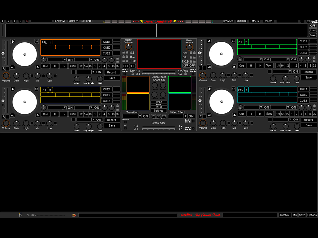
Kinda seems like were after the same thing, "No Pannels"??
Good Luck
Huey

Kinda seems like were after the same thing, "No Pannels"??
Good Luck
Huey
geposted Wed 12 Jan 11 @ 7:18 pm
Why it looks like SSL again ???
geposted Thu 13 Jan 11 @ 7:21 am
killadj4136 wrote :
why the bottom one is better? Oh i don't know, maybe because ... IT ACTUALLY HAS PLAY, PAUSE, CUE, AND SYNC BUTTONS! Also for the sampler thing, it might be better to try and fit all 12 in the mixer. But just the buttons to play the sampler, no info. This is because DJs almost NEVER use just one sampler. It is always 2 or more. Although the deck would be better with the key knob somewhere. That knob is a must.
What im after is a skin that conveys info rather than act as a button interface.
Most controller users already have the basic functions such as playing samples, loops, cue, play already at their fingertips on the controller so wasting screen space on it at the expense of info seems counter intuitive.
In my case the skin should show you what the controller cant. Rather than act as a redundant physical interface. This should be mostly a hands off skin.
geposted Thu 13 Jan 11 @ 10:33 am
Good deal "Meoww",well you have'nt heard from a teamer yet so maybe its O.k.
geposted Thu 13 Jan 11 @ 10:34 pm
I PMed Norway and he hasnt responded yet. Once i get a free moment I will start the graphics so killa can script but will wait for public release until i get the ok form him.
geposted Fri 14 Jan 11 @ 10:05 am
OK, first off, after your response, the top one is better. but also if you are using a controller, why have the EQ in the mixer of the skin? Try taking that out and maybe put the 12 samplers there. I am really stressing those samplers, unless you don't need them, but if this is a public skin, some other DJ might need all 12. Point is, take out those EQ, and use that space for a better, useful cause. Also the VDJ 6 default skin had this feature where you could see how much volume is coming from the left, and how much from the right. You might want to consider that.
geposted Sat 15 Jan 11 @ 11:45 am
killadj4136 wrote :
Also the VDJ 6 default skin had this feature where you could see how much volume is coming from the left, and how much from the right. You might want to consider that.
Not sure what you mean. And I will also include a switchable panel for the samples in the current mixer area.
geposted Wed 19 Jan 11 @ 3:17 pm
i mean compare the vu-meters (the volume meters) of the vdj 6 skin and the vdj 7 skin. You know how there are some songs where the volume on the left is not the same as on the right? The VDJ 6 skin catches this.
geposted Wed 19 Jan 11 @ 7:08 pm
Ah, gotch. Ill look into it.
geposted Thu 20 Jan 11 @ 9:21 am
VU meter left and VU meter right...........
Huey
Huey
geposted Thu 20 Jan 11 @ 10:11 am


