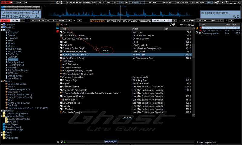
This is my new skin, GHOST LE (Lite Edition)
The reason of the "Lite Edition" on the name is that this skin comes from a far bigger skin project named GHOST v.3 that I haven't released yet.
I designed this skin mainly to use it as a companion to my DENON DN-MC6000.
For this reason this skin features 4 DECKS and it has no internal mixer controls. Also this version does NOT have video. Maybe in a future update I will include video too.
Features:
2 Main Views:
Browser Normal

and Browser Maximized

Different deck colors (Blue/Red) based on the actual working deck. The colors follow the DENON DN-MC6000 logic!
Blue:

Red:

5 Wave Views + Blank
Normal:

Mirrored:

Upside Down:

Double Separate & UpDown:

Scratch:

...and blank:

Custom Buttons:

...and custom icons of course!

A simple Automix panel:

The center of the screen features:
2 Mini scratch discs
An 8 step beat keeper
Wheel Mode indicator for each deck.
Browser Sort Mode indicator
Filter indicators for each deck (see below for more info)

FILTER:
Personally a use a VERY good VST plug-in for filtering named "QB Filter" which you can find and download here: http://studio-qb.com/qb-filter
This filter has many options and it allows you to select 3 different modes: LOW-PASS, HIGH-PASS, and DUAL LOW-PASS - HIGH-PASS.
My skin is coded to work with this plug-in as a filter plug-in. Also, due to some limitations of the effects engine in VDJ I use the QB Filter 4 times with 4 different names (one for each deck).
This means that if you want it to work correctly you'll have to download the plug-in and rename it four times to: QB_Filter1.dll QB_Filter2.dll QB_Filter3.dll QB_Filter4.dll
Please note that you can't manipulate the cut-off frequency from the skin. It ONLY shows you the cut-off.

As a general note please notice that this skin does not have any sliders. This is because as I said I designed this skin to be a companion of my DN-MC6000. All the effect sliders (and others) you might need should be mapped and controlled by your controller.
FINALLY:
This skin was made for personal usage. It is a complete powerful skin but for some of you it might seem a little odd or a little limited on it's functions. I'm always open to suggestions but please keep in mind the philosophy of the skin before asking for a crossfader for instance.
Also you can think of this skin as a mini preview of it's parent "GHOST v.3" which will come later down the road...
Thank you!
PS: The skin is awaiting for approval. Once approved I'll post the download link too!
geposted Thu 17 Feb 11 @ 6:47 am
Please tell me you have a 1920x1080 of this.
geposted Thu 17 Feb 11 @ 1:12 pm
Or even 1920x1200 for us Apple users :)
That would be wicked to use with my MC-6000. You have put a lot of effort in to that skin, it looks fantastic!
Keith
That would be wicked to use with my MC-6000. You have put a lot of effort in to that skin, it looks fantastic!
Keith
geposted Thu 17 Feb 11 @ 1:14 pm
A 1920X version will come soon... I have a second laptop with 1920X1080 native display and the next step is to create this skin in this resolution (true HD graphics on native display, not a resized version) Currently scrren res of this one is 1440X860
geposted Thu 17 Feb 11 @ 2:48 pm
Please a Version in 1280x800
geposted Thu 17 Feb 11 @ 2:54 pm
hi phatomdeejay.
will the skin work with the denon hc4500 it looks pretty good. lots of browser space for looking at songs.
will the skin work with the denon hc4500 it looks pretty good. lots of browser space for looking at songs.
geposted Thu 17 Feb 11 @ 4:48 pm
Of course it will... but you'll still have to use an external mixer though. My second controller is a HC4500 :P (It used to be my primary controller untill 1.5 month ago ;))
geposted Thu 17 Feb 11 @ 5:56 pm
AVAILABLE FOR DOWNLOAD NOW!!!
http://www.virtualdj.com/addons/12751/GHOST_Lite_Edition.html
PS: I forgot to include the tooltips on the browser buttons. So, IN ORDER TO MAX THE BROWSER (Second main view) you have to RIGHT CLICK on the "BROWSER" button.
Same rule applies if you want to get back to normal view...
Thank you!
http://www.virtualdj.com/addons/12751/GHOST_Lite_Edition.html
PS: I forgot to include the tooltips on the browser buttons. So, IN ORDER TO MAX THE BROWSER (Second main view) you have to RIGHT CLICK on the "BROWSER" button.
Same rule applies if you want to get back to normal view...
Thank you!
geposted Thu 17 Feb 11 @ 6:02 pm
Nice one SENOR PHANTOM !!
geposted Thu 17 Feb 11 @ 8:44 pm
Thanks!
geposted Fri 18 Feb 11 @ 3:19 am
Excellent !!! Please post Version 1280x800 and 1680x1050
Greets
viper9711
Greets
viper9711
geposted Fri 25 Feb 11 @ 2:25 pm
phantom deejay, when I use the controller in wheel mode, on the skin_pannel_BIG_ browser, you can still see the wheel mode changes ... here's the screenshot


geposted Wed 30 Mar 11 @ 8:16 am
ok... thanks. I'll fix it asap!
geposted Wed 30 Mar 11 @ 1:43 pm
This is way off topic but... that qb_filter is amazing thanks for the heads up, have you got any other vst goodies you could share? i haven't had much luck finding them
geposted Thu 31 Mar 11 @ 7:55 am
When looking at the key info I noticed a plus sign in front of the digits however the digits read 0.0
Shouldn't it have a plus in front of the digits when the pitch is advanced e.g. 0.1

Shouldn't it have a plus in front of the digits when the pitch is advanced e.g. 0.1

geposted Fri 01 Apr 11 @ 4:55 am
The "+" sign comes from VDJ engine... I can't manipulate that I'm afraid...
geposted Fri 01 Apr 11 @ 5:18 am
+0.0 % or - 0.0 % means that pitch is not exactly 0%. It could be -0.01% or +0.02%. Pitch is displayed with only 1 decimal digit.
geposted Fri 01 Apr 11 @ 5:26 am
Ahh, then it should be displayed as +0.02%
geposted Fri 01 Apr 11 @ 5:33 am
And may i ask how would this help you to mix better? If it shows you + or - 0.0% this means that is not exactly 0%. What will you do? Try to adjust 0% with your pitch slider????
geposted Fri 01 Apr 11 @ 5:41 am
Yes I would try to adjust, VDJ adjusts in 10th increments doesn't it?

Anyway I think this would be nice, unfortunatly my text once uploaded isn't clear but Ill translate it for you.
It says, Wave section, previem window, main output preview. This would be compact, neat and workable.

Anyway I think this would be nice, unfortunatly my text once uploaded isn't clear but Ill translate it for you.
It says, Wave section, previem window, main output preview. This would be compact, neat and workable.
geposted Fri 01 Apr 11 @ 6:03 am


