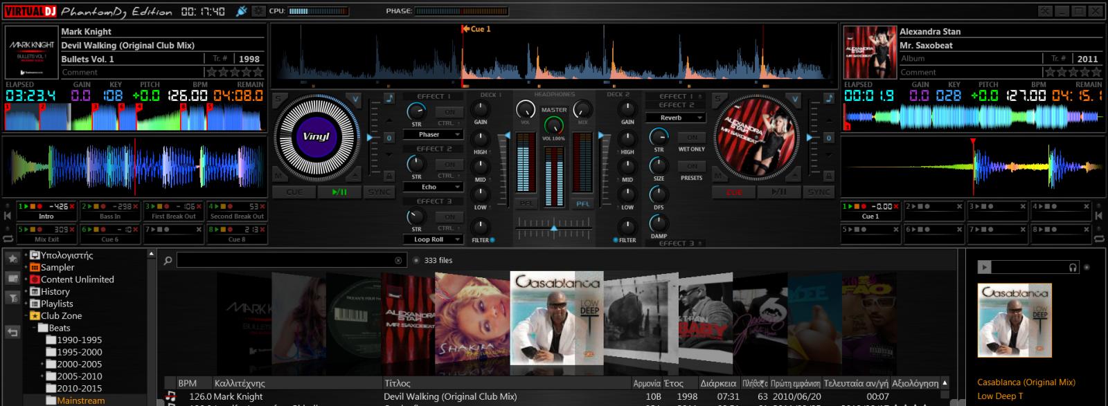
Nice Phantom!!
geposted Mon 26 May 14 @ 5:18 pm
shame about the waveform colors, but the skin looks great!
geposted Tue 27 May 14 @ 4:32 am
You mean rythmview colors ?
I never really liked RED as a wave color. It makes much more sense to use it as a needle color or as something that needs attention...
I never really liked RED as a wave color. It makes much more sense to use it as a needle color or as something that needs attention...
geposted Tue 27 May 14 @ 5:08 am
yep it cheapens the look of the software, maybe if we could control the alpha/opacity of the songpos waves it would be less intense.. but I love your gradients, controls and especially the layout.
geposted Tue 27 May 14 @ 5:42 am
In a future version I'd like to be able to designate different songpos markers for cues, loops etc.
geposted Tue 27 May 14 @ 5:57 am
I'm always amazed at the creations you guys come up with!! I'm struggling just trying to get cover art to show up, lmao!!
The skin looks badass though, keep up the great work!!
The skin looks badass though, keep up the great work!!
geposted Tue 27 May 14 @ 7:43 am
That looks awesome! Just please make sure that it's tested on a Mac. (Most skins are not and have odd positioning issues!)
geposted Tue 27 May 14 @ 10:44 am
very nice !!!!
bravo
bravo
geposted Tue 27 May 14 @ 1:06 pm
So with the new skin engine it is possible to display the cue nunber of on the songpos element! Am I write ?
geposted Tue 27 May 14 @ 2:58 pm
Looks great!!
geposted Wed 28 May 14 @ 4:42 am
Achileas7 wrote :
So with the new skin engine it is possible to display the cue nunber of on the songpos element! Am I write ?
Almost right... But yes, it can be done somehow!!! :)
geposted Wed 28 May 14 @ 5:50 am
Very nice!
More pictures?
More pictures?
geposted Wed 28 May 14 @ 6:47 am
Excellent looking.
Is it possible to have the comment field show like it does on the Mixlab 3.1 skin?
Is it possible to have the comment field show like it does on the Mixlab 3.1 skin?
geposted Wed 28 May 14 @ 7:57 am
Superb!
geposted Wed 28 May 14 @ 2:41 pm
Looking good. For me, it'd be great to actually remove the FX and Cue Point sections (I never use them), then shorten the mixer section (or remove it entirely, never use that either).
Remove any Cover Art functionality, and make the browser section ABAP (as big as possible).
But I wouldn't kick this skin out of bed for eating crackers as-is......
Remove any Cover Art functionality, and make the browser section ABAP (as big as possible).
But I wouldn't kick this skin out of bed for eating crackers as-is......
geposted Thu 29 May 14 @ 10:26 am
When do you think this would be released? Looking forward to it!!
geposted Sun 01 Jun 14 @ 10:43 pm
When I find a name :P
Honestly it should be ready this week...
Honestly it should be ready this week...
geposted Mon 02 Jun 14 @ 2:39 am
The name may be the Phantom super 8
however it is nice
however it is nice
geposted Mon 02 Jun 14 @ 2:49 am
Call it "Fifty Shades Of Grey"....
geposted Mon 02 Jun 14 @ 4:46 am


