hello,
Here is my new skin Black Millenium V5, the V4 adapting to VDJ8. It's not quite finished, but it will not be long.
I added the most new options VDJ8 and I have a somewhat modified design.
2 decks for the moment, once more wide waveforms and colors a little less playskool ^^ (I hate the look red & Blue)
in HD : HD screen
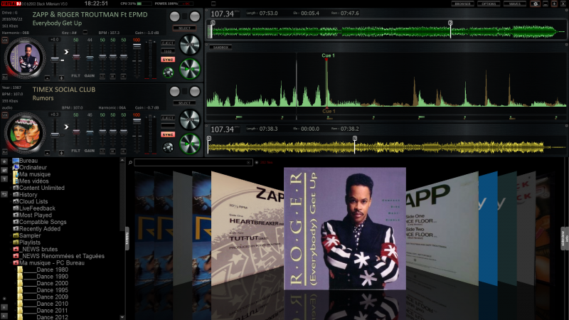
On each deck, you can either select the center panel:
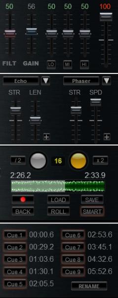
(coming soon a Scratch panel and a Video panel)
between the waveforms a panel of miscellaneous options:

(among other masking BPM and any mix assistance )
On the right will coming the Master video.
3 Jogwheel choice:

On each deck we can choose the tags you want to display:
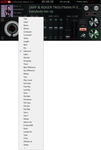
At the top, a small button reveals Custom Buttons at will (or not):

you can choose between 5 faders, 15 small buttons, 10 medium buttons or 5 large buttons.
Choose between several types of waveforms (still to make some corrections on this side):
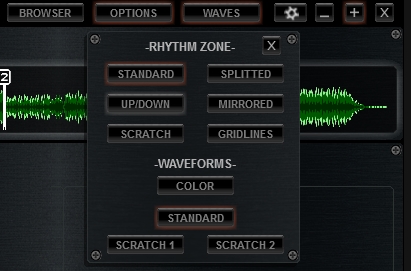
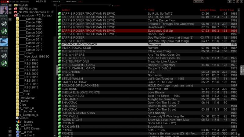
Fullscreen Browser page for extensive research:
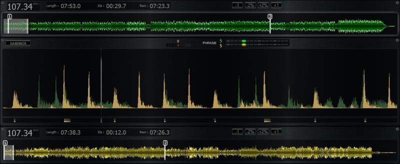
Some mix assistance tools (phraser, sync dial or beat jumper): (tools that you can hide)
Decks and waveforms frames are lighting according to the situation: (tools that you can hide)
Deck volume =0 : (=deck inactive)
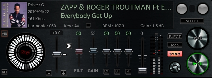
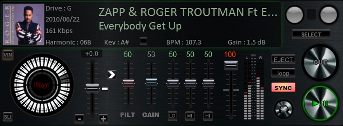
Deck volume > 0 : (=deck active)
the track length is nearing the end (becomes blinking) :
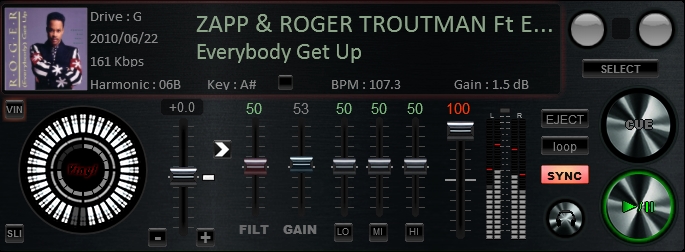
Pitch = 0 : (=not synchronized ?)

A loop is active :

the track length is nearing the end (becomes blinking) :

I tested this skin at a party and it already works perfectly, but before I putting it online I still have to make some graphics corrections.
Later I'll add the video and thr scratch panels and may be an option for a third deck.
If you have any criticism, suggestions or comments, please do not hesitate !!!!
(sorry for my pitiful English ...)
Here is my new skin Black Millenium V5, the V4 adapting to VDJ8. It's not quite finished, but it will not be long.
I added the most new options VDJ8 and I have a somewhat modified design.
2 decks for the moment, once more wide waveforms and colors a little less playskool ^^ (I hate the look red & Blue)
in HD : HD screen

On each deck, you can either select the center panel:

(coming soon a Scratch panel and a Video panel)
between the waveforms a panel of miscellaneous options:

(among other masking BPM and any mix assistance )
On the right will coming the Master video.
3 Jogwheel choice:

On each deck we can choose the tags you want to display:

At the top, a small button reveals Custom Buttons at will (or not):

you can choose between 5 faders, 15 small buttons, 10 medium buttons or 5 large buttons.
Choose between several types of waveforms (still to make some corrections on this side):

Fullscreen Browser page for extensive research:

Some mix assistance tools (phraser, sync dial or beat jumper): (tools that you can hide)

Decks and waveforms frames are lighting according to the situation: (tools that you can hide)
Deck volume =0 : (=deck inactive)

Deck volume > 0 : (=deck active)

the track length is nearing the end (becomes blinking) :

Pitch = 0 : (=not synchronized ?)

A loop is active :

the track length is nearing the end (becomes blinking) :

I tested this skin at a party and it already works perfectly, but before I putting it online I still have to make some graphics corrections.
Later I'll add the video and thr scratch panels and may be an option for a third deck.
If you have any criticism, suggestions or comments, please do not hesitate !!!!
(sorry for my pitiful English ...)
geposted Tue 04 Nov 14 @ 9:20 am
It looks great ! !! GG Chris !
geposted Tue 04 Nov 14 @ 12:05 pm
Very good work here. i'm looking forward to trying this on out..
especially like the full screen browser and tiny players on the left.
Inbox me if you'd like me to do any testing for you.
especially like the full screen browser and tiny players on the left.
Inbox me if you'd like me to do any testing for you.
geposted Thu 06 Nov 14 @ 3:45 pm
Thanks.
there are still much work to do, but the skin is functional.
Leave me an email address by mp and I send you the file :-)
there are still much work to do, but the skin is functional.
Leave me an email address by mp and I send you the file :-)
geposted Thu 06 Nov 14 @ 3:51 pm
4 Deck version, I'm hoping ........ Looks really good !
geposted Mon 10 Nov 14 @ 3:40 pm
4 deck will be complicated, I instead imagined a 3 deck version ^^
geposted Mon 10 Nov 14 @ 8:00 pm
Dodge57 wrote :
colors a little less playskool (I hate the look red & Blue)
Me too! This looks a lot like how I imagine a 1 deck track preparation (off line) skin should look, really clarity on the waves.
Looking good.
geposted Wed 12 Nov 14 @ 9:28 am
The skin was suggested to the Team :-)
geposted Wed 12 Nov 14 @ 9:35 am
Version 8 skins should be submitted to the version 8 Plugin page not 7.
http://www.virtualdj.com/plugins/upload.html
Please submit again.
http://www.virtualdj.com/plugins/upload.html
Please submit again.
geposted Wed 12 Nov 14 @ 10:16 am
oh, sorry !! I do it immediately
Thanks
Thanks
geposted Wed 12 Nov 14 @ 11:46 am
Sorry, but no zip file was uploaded. All i see as Source is a Présentation_Upload.jpg file along with some other Screenshots images
geposted Thu 13 Nov 14 @ 7:20 pm
Damn, I must have done a blunder ...
I have to completely redo the download or I can add to what I have already sent ?
I have to completely redo the download or I can add to what I have already sent ?
geposted Thu 13 Nov 14 @ 10:05 pm
I do a new upload
geposted Fri 14 Nov 14 @ 10:18 am
I just found a bug with the key panel (this is a feature that I don't use, so I had not noticed right away, sorry)
It's fixed, I would send correction on line after the review.
It's fixed, I would send correction on line after the review.
geposted Sun 16 Nov 14 @ 11:26 am
Ok, you may still update that later. The Key panel is indeed minor, so i made the skin available http://www.virtualdj.com/plugins/index.html?addonid=80148
geposted Sun 16 Nov 14 @ 5:39 pm
Very nice, Slight problem with scratch waves not bring in sync with the CBG, default wave event line is in the first quarter on the wave space, scratch event line is in the centre of the wave space.
geposted Sun 16 Nov 14 @ 6:45 pm
Thank you Djdad. I uploaded the correction.
locodog, I don't anderstand you problem. Indeed I shifted the center of all waveforms except scratch because it seems more appropriate.
But this doesn't affect the synchro, no ?
locodog, I don't anderstand you problem. Indeed I shifted the center of all waveforms except scratch because it seems more appropriate.
But this doesn't affect the synchro, no ?
geposted Sun 16 Nov 14 @ 8:29 pm
I think a pic explains what I mean
http://pbrd.co/1zuGdcm
http://pbrd.co/1zuGdcm
geposted Sun 16 Nov 14 @ 9:21 pm
ok, that's what I said, only scratchwaves are centered, the others are shifted.
But it should not be a problem, the extent that you mix with one or the other.
this doesn't affect the synchro !
I would liked shift the center of all waveforms, because observe the past has no interest. However it's the future that interests us.
But it's impossible to shift the center of the scratchwaves.
what would you have liked ?
[EDIT] I just saw that there is still a bug in scratchwaves, the texts of cuespoints are offset (that is following a modification I made it a few days ago and I forgot that detail).
I'll post the correction quickly.
geposted Mon 17 Nov 14 @ 7:23 am
currently under review by the team, these corrections:
- Position text cue points for scratchwave
- Highlight color of active menu buttons in the browser
- Position text cue points for scratchwave
- Highlight color of active menu buttons in the browser
geposted Tue 18 Nov 14 @ 9:17 am


