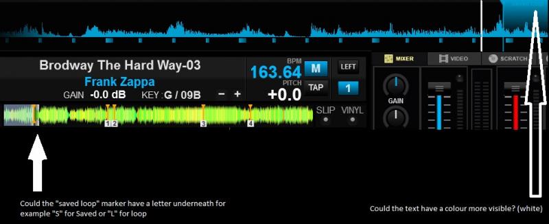
As the text in the picture says:
The text "Saved loop" is hard to read. Perhaps it can be done in white or a colour with more contrast to the loop-area marker.
Also, the saved loop marker in track overview should perhaps have markers that has a letter underneath it, to inform what it is. Or, the entire loop-area could be indicated with start and stop markers.
EDIT: Could these be skin dependent?
geposted Thu 23 Apr 15 @ 6:19 am
Is it possible by skin, change the colour of the text "saved loop" ?
Also, would it be possible to have a visual indication of the loop start and stop in the track waveform (for each deck) where the cue points show up?
This skin is BGL 4 deck
Perhaps a mod could move this thread to where it better belongs as well.
Also, would it be possible to have a visual indication of the loop start and stop in the track waveform (for each deck) where the cue points show up?
This skin is BGL 4 deck
Perhaps a mod could move this thread to where it better belongs as well.
geposted Mon 04 May 15 @ 2:06 am
MrJackson2014 wrote :
Perhaps a mod could move this thread to where it better belongs as well.
Done!
geposted Mon 04 May 15 @ 2:55 am


