


 wildcountryclub
anyway to change these back to what they were on the right?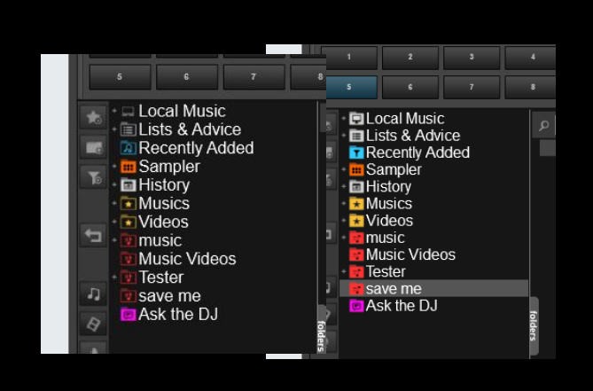
geposted Wed 10 Jul 19 @ 8:34 am
 fallguy66
Why would anyone want to change these cutting edge icons?
geposted Wed 10 Jul 19 @ 11:16 pm
wildcountryclub
so we can see them?
geposted Thu 11 Jul 19 @ 6:27 am
 Dj Chachi
Like the older ones, glad I haven't updated. Will wait for the icon come back or new design ones.
geposted Thu 11 Jul 19 @ 11:51 am
fallguy66wildcountryclub wrote :
so we can see them?
I see them clearly and they are very pleasing to the eye...
geposted Thu 11 Jul 19 @ 3:12 pm
 groovindj
I can see mine too...
geposted Thu 11 Jul 19 @ 4:29 pm
fallguy66
Yes a picture of beauty...
geposted Thu 11 Jul 19 @ 5:14 pm
wildcountryclub
so "screw you" to anyone who is visually impaired who uses the brighter colors to help easily recognize even when not having their face buried in the screen?
the difference in visibility for workflow is markedly better with the original default. and easy to see from a distance and from up cluse when seconds count.
the difference in visibility for workflow is markedly better with the original default. and easy to see from a distance and from up cluse when seconds count.
geposted Fri 12 Jul 19 @ 2:07 am
fallguy66wildcountryclub wrote :
so "screw you" to anyone who is visually impaired who uses the brighter colors to help easily recognize even when not having their face buried in the screen?
the difference in visibility for workflow is markedly better with the original default. and easy to see from a distance and from up cluse when seconds count.
the difference in visibility for workflow is markedly better with the original default. and easy to see from a distance and from up cluse when seconds count.
The real issue is: Do you want to be cutting edge or live in the 20th century?
geposted Fri 12 Jul 19 @ 2:28 am
 A Man and His Music
Wild.…..I was, but decided not to.
geposted Fri 12 Jul 19 @ 3:32 am
wildcountryclub
what i want is to be able to quickly and clearly SEE and recognize files without having to stick my face in the screen to differentiate between folders and file types.
a lot of us can't help the ravages of time, eye strain, and bad living over decades of doing this for a living.
and 'cutting edge' usually means improvement... this is not an improvement if it disrupts workflow and makes things more difficult for users.
a lot of us can't help the ravages of time, eye strain, and bad living over decades of doing this for a living.
and 'cutting edge' usually means improvement... this is not an improvement if it disrupts workflow and makes things more difficult for users.
geposted Fri 12 Jul 19 @ 4:15 am
 PhantomDeejay
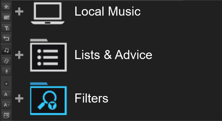
File icons are the same. Only folder icons have changed.
Also in terms of text readibility latest versions have added new options (like padding) in order to increase font/text readibility on browser.
Also you can change the font size on the fly, and the icon size will follow the font size.
I don't argue that you prefer the old icons versus the new ones.
I argue the fact that we're doing steps towards improving the readability of the browser and not the opossite as you imply.
IMHO it's much easier to read text now than it was before.
geposted Fri 12 Jul 19 @ 11:44 am
Can I ask which resolution and size your screen has?
On the first screenshot it appears the resolution is relatively low and the down-scaling may cause the outlines of the icons to appear thinner than it should.
On the first screenshot it appears the resolution is relatively low and the down-scaling may cause the outlines of the icons to appear thinner than it should.
geposted Fri 12 Jul 19 @ 12:24 pm
fallguy66wildcountryclub wrote :
what i want is to be able to quickly and clearly SEE and recognize files without having to stick my face in the screen to differentiate between folders and file types.
a lot of us can't help the ravages of time, eye strain, and bad living over decades of doing this for a living.
and 'cutting edge' usually means improvement... this is not an improvement if it disrupts workflow and makes things more difficult for users.
a lot of us can't help the ravages of time, eye strain, and bad living over decades of doing this for a living.
and 'cutting edge' usually means improvement... this is not an improvement if it disrupts workflow and makes things more difficult for users.
This is a vast improvement. Pleasing to the eye. Makes for a serine work place. I importune the developers to create more changes like this one!
geposted Fri 12 Jul 19 @ 3:53 pm
A Man and His Music
It may be an improvement to you, but not to all of us. We are not the same, so your opinion is just that. There have been many improvements here, and some of them were highly offensive to some of our members. They had a fit about some of them, and the company gave them the options that they wanted. I have gone along with all of them, and thought the company was caving to the pressures of a few, but if it helped some of us, who am I to let my opinion get in the way of helping others? I have a 27 inch monitor, and don't like these new icons. The fact that you like them and think they are 21st century, (what does that even mean in terms of a icon?) is your opinion. That actually means nothing to the others here. How does it affect you if they give us the option to pick which one we like? I am not a coder, and don't plan on being one, so going into all of the expert stuff, is out of limits to me and others. Just make it so we all can be happy, as you have done so many times in the past. I would not even be in this post, and would have went along with the changes, as I have with all the others. However, it is clear that I am not the only one that would like the option.
geposted Fri 12 Jul 19 @ 4:45 pm
groovindj
You don't have to be a coder or an expert to use djdad's Browser Tweaks addon to change the icons on a skin.
geposted Fri 12 Jul 19 @ 4:51 pm
wildcountryclubAdion wrote :
Can I ask which resolution and size your screen has?
On the first screenshot it appears the resolution is relatively low and the down-scaling may cause the outlines of the icons to appear thinner than it should.
On the first screenshot it appears the resolution is relatively low and the down-scaling may cause the outlines of the icons to appear thinner than it should.
27" full HD 1920x1989 not sure what skin resolution is as it's not taking up all of the monitor - which is how the setup at the club is where we have a larger monitor so that we can use other parts of the screen.
screen shots were taken with windows snipping tool, copied and pasted into photo editor and layered for side by side. no idea what actual skin size is on monitor - had it sized so that I could see things while streaming to facebook and haven't measured yet
geposted Fri 12 Jul 19 @ 8:16 pm
 djjohnnyrox
Other than the icons being uglier I could deal with the text either way...... And i usually bitch about everything! that being said hopefully the powers that be will allow a check box which will give us the choice between modern or classic text/icons
geposted Fri 12 Jul 19 @ 8:37 pm
fallguy66A Man and His Music wrote :
It may be an improvement to you, but not to all of us. We are not the same, so your opinion is just that. There have been many improvements here, and some of them were highly offensive to some of our members. They had a fit about some of them, and the company gave them the options that they wanted. I have gone along with all of them, and thought the company was caving to the pressures of a few, but if it helped some of us, who am I to let my opinion get in the way of helping others? I have a 27 inch monitor, and don't like these new icons. The fact that you like them and think they are 21st century, (what does that even mean in terms of a icon?) is your opinion. That actually means nothing to the others here. How does it affect you if they give us the option to pick which one we like? I am not a coder, and don't plan on being one, so going into all of the expert stuff, is out of limits to me and others. Just make it so we all can be happy, as you have done so many times in the past. I would not even be in this post, and would have went along with the changes, as I have with all the others. However, it is clear that I am not the only one that would like the option.
I have not said this is anything else but my opinion. You have expressed your opinion. So now that we both have expressed our opinions, let us agree that these beautiful icons should be given a chance for the few detractors to get used to...
geposted Fri 12 Jul 19 @ 9:27 pm