


 sirkitbreaker
djrasza wrote :
only thing i would say about a logo like this is you need to think of reproduction. this would required color reproduction and honestly could end up looking not quite right if reproduced on a hat or t-shirt but would look good on the web
geposted Sun 01 Feb 09 @ 4:10 pm
 spinnaJ
wildcountryclub wrote :
Winner to be announced next February 31st!
Afraid the date will never come;)
Back on topic.. wow there certainly lot of creativity here;)
geposted Sun 01 Feb 09 @ 4:12 pm
sirkitbreaker
had a bit before super bowl

geposted Sun 01 Feb 09 @ 5:00 pm
*blink. . . blink* Wow. You guys are amazing! I ask for some help with ideas and I get a contest! Even if there were no other reasons (which of course there are!), the community alone makes VDJ the best!
These are great. Maybe we could try a few with wave forms, and possibly one or two classy/elegant ones (like for weddings) for some contrast and variety.
Thanks a lot everyone! And who knows... maybe we announce winner before Feb 31 ;-)
These are great. Maybe we could try a few with wave forms, and possibly one or two classy/elegant ones (like for weddings) for some contrast and variety.
Thanks a lot everyone! And who knows... maybe we announce winner before Feb 31 ;-)
geposted Sun 01 Feb 09 @ 5:24 pm
 dj schmidty
WOW!!
Can you make one of these for me??
http://www.artiscommunication.com/st2.jpg
Can you make one of these for me??
http://www.artiscommunication.com/st2.jpg
geposted Sun 01 Feb 09 @ 7:27 pm
 ShyneGTA
geposted Sun 01 Feb 09 @ 10:06 pm
ShyneGTA

geposted Sun 01 Feb 09 @ 10:58 pm
sirkitbreakerdjrasza wrote :
one thing to notice is white type is hard to read from a distance and if that logo was shrunk down the dj steve would be hard to read. also who other than a dj knows what a crossfader is? a logo should be directed towards clients not compitition.
geposted Sun 01 Feb 09 @ 10:59 pm
 Tear Em 'Up
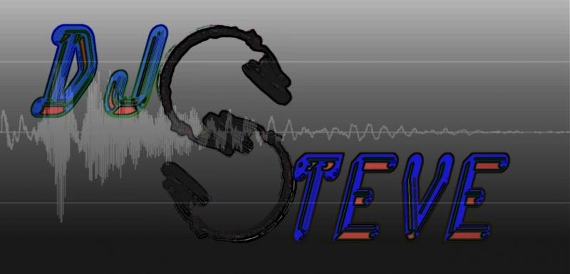
this is a .png file..the background is clear, allowing any color to be used under it.
geposted Sun 01 Feb 09 @ 11:02 pm
sirkitbreaker
here are a few pointers when designing logos.
less is more
thick bold fonts represent stability and confidence
sarif fonts represent delicasy
non grounded or floating objects take away impact
photos dont make good logos cause logos are iconic by nature
less is more
thick bold fonts represent stability and confidence
sarif fonts represent delicasy
non grounded or floating objects take away impact
photos dont make good logos cause logos are iconic by nature
geposted Sun 01 Feb 09 @ 11:41 pm
sirkitbreakerTearEmUp wrote :
this is a .png file..the background is clear, allowing any color to be used under it.
this is a .png file..the background is clear, allowing any color to be used under it.
i would say with this logo the main part of the logo should be the name. however the name is the thinnest element. the flags of the notes direct the eye past the name again not helping the name to be important
geposted Sun 01 Feb 09 @ 11:45 pm
 VanStino
This is my logo, for some ideas. It contains the company I work with and has an important place for the website, something that is gravely overlooked nowadays. I didn't make this myself, it was done professionally.
geposted Mon 02 Feb 09 @ 6:00 am
 wildcountryclub
it's weird but we kept forgetting he wanted a waveform in it...
geposted Mon 02 Feb 09 @ 7:43 am
sirkitbreaker
heres another change of direction not a full idea

geposted Mon 02 Feb 09 @ 8:39 am
 sonido1902
Do you guys use Photo Shop for this?????????????????????
geposted Mon 02 Feb 09 @ 11:17 am
Tear Em 'Upsonido1902 wrote :
Do you guys use Photo Shop for this?????????????????????
I'm using Jasc Paint Shop Pro. Photo Shop is the preferred software but, Gimp is a decent knock off of Photo Shop. Its a free download as well.
geposted Mon 02 Feb 09 @ 11:19 am
sonido1902
i got photo shop portable but ive used it once but no fancy stuff i serously need to use it..hmm gimp...free..ok yall going to see a piece of my work in a while :D!!!
geposted Mon 02 Feb 09 @ 11:22 am
Tear Em 'Up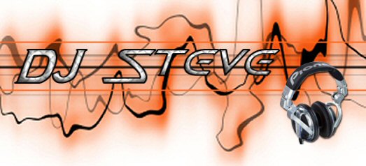
geposted Mon 02 Feb 09 @ 12:01 pm
 mini reaper
DJ REAPER IS BEGGING FOR ONE LOL>>>from terry and others..lol if posible..lol
geposted Mon 02 Feb 09 @ 12:28 pm
sonido1902TearEmUp wrote :
hey hey those are my headphones!!!hahahaha.........
geposted Mon 02 Feb 09 @ 3:32 pm