Well,
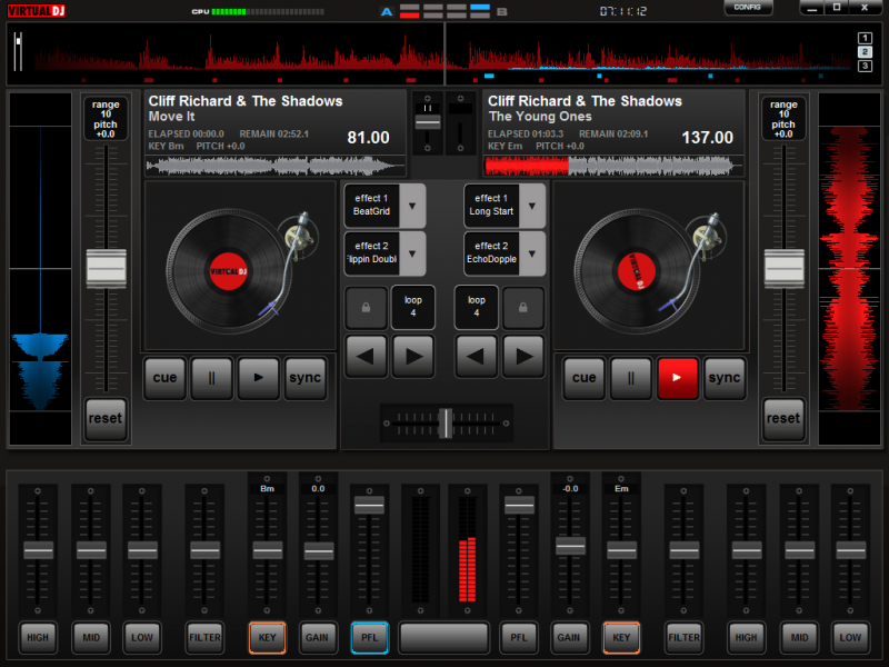
I started again last week with a new skin. After years of skinning and using virtualdj I still like the original skin. But those little buttons do not work with touchscreen, so I disided to create a new one. I started with a resolution of 1024x768pxl and 2 pannels.
One for the decks.
And one for the browser.
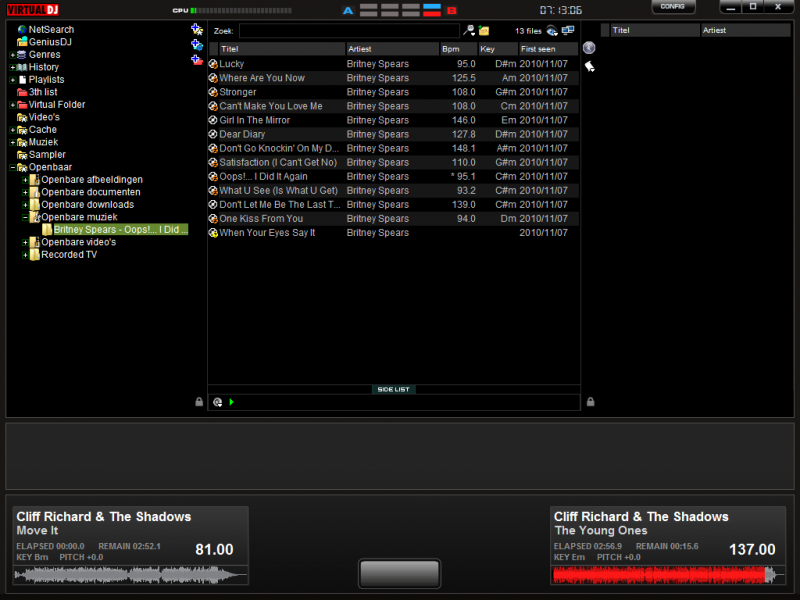
Stil working on it. So if you have any suggestions.
Last but not least. I am using the original skins from vdj 4,5,6,7 So I have to ask the team for permission.
So team, what do you think, can I work this out?
Best regards,
John
I started again last week with a new skin. After years of skinning and using virtualdj I still like the original skin. But those little buttons do not work with touchscreen, so I disided to create a new one. I started with a resolution of 1024x768pxl and 2 pannels.
One for the decks.

And one for the browser.

Stil working on it. So if you have any suggestions.
Last but not least. I am using the original skins from vdj 4,5,6,7 So I have to ask the team for permission.
So team, what do you think, can I work this out?
Best regards,
John
geposted Sat 04 Dec 10 @ 12:38 am
The concept of using the complete screen (touch or not) for either deck operation or file browsing is something I was thinking about this week also. To my opinion many skins try to incorporate way to much buttons / info into the screen. MAking all this buttons, fonts or whatever infomation spitting interface to small.
Splitting it all up and using pannels and the strong script language. It should be possible to create some nice clean and much more purpose oriented screen layouts like the one you are showing here.
I tend to fall back on the basics of the original v7 or the CE skin a lot. I did some modifications to CE in order to connect better to my style of DJ-ing.
In general I would reccomend to keep it a nice clean skin. Love to see what you come up with !
- Ruud -
geposted Sat 04 Dec 10 @ 8:07 am
Beautiful, just what I need for the iPad.
Keith
Keith
geposted Sat 04 Dec 10 @ 11:26 am
Hi,
Still working on it, but for now, this is what I have.
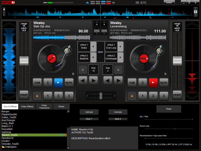
As you can see I made some smart_cue buttons and for the effects I made a button to go to the effects-page(no browser or sampler enz).
Also some smart-buttons like play loop and cue. Ow.. and ofcourse the pich-bend buttons on top and bellow the scratchwaves.
So far..
Best regards,
John
Still working on it, but for now, this is what I have.

As you can see I made some smart_cue buttons and for the effects I made a button to go to the effects-page(no browser or sampler enz).
Also some smart-buttons like play loop and cue. Ow.. and ofcourse the pich-bend buttons on top and bellow the scratchwaves.
So far..
Best regards,
John
geposted Sun 05 Dec 10 @ 1:29 am
Video pannels???
geposted Sun 05 Dec 10 @ 5:35 am
discobrian24 wrote :
Video pannels???
comming up.. Maybe on the bottum or at the same place where the vinyl's are. I can't work without video anymore.....lol..... :)
geposted Sun 05 Dec 10 @ 12:56 pm
Seems you are a big Wesley fan ;-)
geposted Sun 05 Dec 10 @ 5:36 pm
Congratulations on the skin, waiting to use it
geposted Mon 06 Dec 10 @ 4:09 pm
Hi all,
I made video-pannels on the same place as the vinyl is and I had to find a way for the sampler to use it easier(bigger buttons).
So another pannel for the sampler(well, 25 exactly....lol..., see picca)

I still have issues with the browser. When I switch pannels, a flickerring box at the top-left-corner shows up for a very short time.
But I did not put something there. My browser-pannels (you can't see) are out of the screen at x=1024 y=35.
For the rest....It works fantastic.....
Best regards,
John
I made video-pannels on the same place as the vinyl is and I had to find a way for the sampler to use it easier(bigger buttons).
So another pannel for the sampler(well, 25 exactly....lol..., see picca)

I still have issues with the browser. When I switch pannels, a flickerring box at the top-left-corner shows up for a very short time.
But I did not put something there. My browser-pannels (you can't see) are out of the screen at x=1024 y=35.
For the rest....It works fantastic.....
Best regards,
John
geposted Wed 08 Dec 10 @ 11:48 pm
update
The browser part.
The big wheel is for scroll.
I tried to find a way for fast scrolling and I have to say, with touchscreen it works but with mousse it is not recomended.
The options button on the right shows different options. Depending on the view.
The boxes for the decks are buttons to load a song. And the box at the center is the browsed info, also clickable for editing.

The browser part.
The big wheel is for scroll.
I tried to find a way for fast scrolling and I have to say, with touchscreen it works but with mousse it is not recomended.
The options button on the right shows different options. Depending on the view.
- folders = search-options
- browser = view-options
- playlist = playlist options
The boxes for the decks are buttons to load a song. And the box at the center is the browsed info, also clickable for editing.

geposted Fri 10 Dec 10 @ 12:53 am
just bought a touch screen, PM me if you need test persons.
Very interesting part is indeed the scrolling in the browser and assigning a song to a deck. Mainly this is the painlfull part on current skins when using touch.
just a question, will there be a big button to activate the browser zoom function?
And once you are in Zoom mode, would it be possible to use panels.
- Your panel with the scrolling wheel and dropzonde to add the song to the appropriate deck (Would love to see it for 4 decks)
- Browser area itself
So when you scroll with the wheel, it should go to the list of songs
(see picture)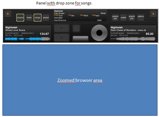

geposted Fri 10 Dec 10 @ 5:52 am
@ Johans,
Hi,
No, I do not use the browser-zoom because when browser-zoom is active, there is nothing left over of the screen, and you can not resize it.
This is what I have now..
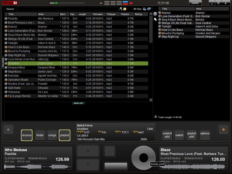
The scroll wheel works good with the songs-view, sidelist and playlist. It works like a round slider.
When focused on folders you can touch the weel but it only goes down. But the scroll-buttons are working to.
Believe me. It works better then without..hahaha.
About the four decks. I can make four decks but I have to finnish this one first.
Latest things added:
dropzones.
Special load-deck fuction for the decks in the player-panel. It load the first track from the playlist (fast loading without switching panels).
Best regards,
John
Hi,
Johans wrote :
will there be a big button to activate the browser zoom function?
And once you are in Zoom mode, would it be possible to use panels.
will there be a big button to activate the browser zoom function?
And once you are in Zoom mode, would it be possible to use panels.
No, I do not use the browser-zoom because when browser-zoom is active, there is nothing left over of the screen, and you can not resize it.
This is what I have now..

The scroll wheel works good with the songs-view, sidelist and playlist. It works like a round slider.
When focused on folders you can touch the weel but it only goes down. But the scroll-buttons are working to.
Believe me. It works better then without..hahaha.
About the four decks. I can make four decks but I have to finnish this one first.
Latest things added:
dropzones.
Special load-deck fuction for the decks in the player-panel. It load the first track from the playlist (fast loading without switching panels).
Best regards,
John
geposted Fri 10 Dec 10 @ 8:50 am
Hi John, looking good. I use my ipad in the club early doors at weekends so let me know if you want some live beta testing.
I'm still using the default VDJ 1024x768 which works well but some of the buttons are a bit small as you know!
Keith
I'm still using the default VDJ 1024x768 which works well but some of the buttons are a bit small as you know!
Keith
geposted Fri 10 Dec 10 @ 9:15 am
Thanks John for your information, looks goor the way you solved it. Waiting to test.
Question, will it come in 1920*1080 resolution too?
Question, will it come in 1920*1080 resolution too?
geposted Sun 12 Dec 10 @ 6:25 am
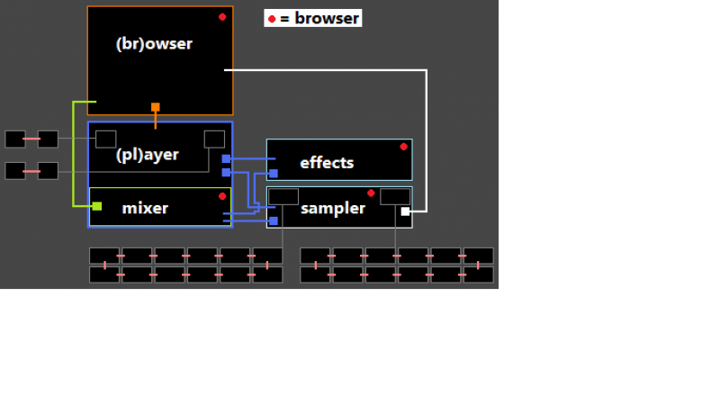
I finnish this one first before starting another size.
I had a little issue with the browser. I had to make a schedule for all the pannels, so I could find where the problem was.
Now I have this, so why not put it in this topic.
Today I found a problem with the Firetext-plugin. It doesn't fit in the litle browser. So I have to make buttons for the big browser.
It's not easy in use but bether than no use.

geposted Sun 12 Dec 10 @ 1:41 pm
Hi John, thanks for the opportunity to test the skin on your behalf.
In a word it's brilliant. Spent over an hour working from the ipad and it works perfectly. Only change I would request is making the browser tracks with bigger text and more of a gap between them. It's still a bit tight to click with a finger although the scroll wheel is a great idea.
Here are a couple of photos of your skin running live on the ipad. This will help a lot in the club this weekend as I am in the restaurant Friday night and walk about a lot getting requests.
Thanks
Keith


geposted Tue 14 Dec 10 @ 2:54 pm
John, it looks fantastic ! I love the layout.
geposted Tue 14 Dec 10 @ 3:40 pm
Hi all,
@ kradcliffe
Thanks for your input and time.
First..I tought the i-Pad was running Mac, but I see the windows-layout.
The text-size is to small. I was thinking of that yesterday. I change the size of the text in the browser.
@djdad
Thanks man, I was looking at your video yesterday of your touchscreen skin. Amazing.
Still trying to find a way for your round sliders(no succes at all)
The smartcue-buttons will be half the size, because I mis the delete-cue function. And I'm looking for space to make the master video-window.
That all for now, I've gotta go.
Best regards,
John
geposted Wed 15 Dec 10 @ 12:15 am
Hi
Fantastic Skin
Is it possible to use the browser skin on a 13" Notebookscreen 1280x800 solution, and the skin with player and the rest on a 22" Touchscreen with 1650x1080....
Great job
chris
Fantastic Skin
Is it possible to use the browser skin on a 13" Notebookscreen 1280x800 solution, and the skin with player and the rest on a 22" Touchscreen with 1650x1080....
Great job
chris
geposted Wed 15 Dec 10 @ 3:01 am
Hi,
Then you have two skins ? You can not use the browser than.
This is one skin with different layouts.
Years ago you had to turn around for a record or cd, nou you click a button.
What you want can be done. With a res. of 2930x1080pxl.
Then you have two skins ? You can not use the browser than.
This is one skin with different layouts.
Years ago you had to turn around for a record or cd, nou you click a button.
What you want can be done. With a res. of 2930x1080pxl.
geposted Wed 15 Dec 10 @ 9:19 am


