It's been a while since i made a custom skin. Here is one i had fun with
BLOCKS
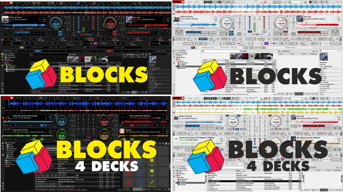
Choose from the top :
- Mixer
- FX Panel (Single & Multi mode, FX On Master when Mixer is extended)
- Sampler Panel with FX on Sampler
- Video panel with Visualization and V.FX per Deck
- Record & Broadcast Panel
- In & Outs (Master, Booth, Headphones, Mic & FX, Crossfader & Fader Curves)
- Additional Browser on floating Window
Some more features..
- KEY and CBG Edit panels (click on the KEY and BPM labels on Deck)
- 3 Custom buttons below Jog
- Deck can display Cover/Video/Nothing
- Jog can display Remain or Elapsed Time
- Loop Normal/Advanced view
- Browser Zoom view
Download Link : http://www.virtualdj.com/plugins/index.html?addonid=80677
Enjoy ;)
Changelog
Version 1.2
Version 2.0
Version 3.0
Version 4.0
* Note: Some features require latest Early Access 5269
BLOCKS

Choose from the top :
- Mixer
- FX Panel (Single & Multi mode, FX On Master when Mixer is extended)
- Sampler Panel with FX on Sampler
- Video panel with Visualization and V.FX per Deck
- Record & Broadcast Panel
- In & Outs (Master, Booth, Headphones, Mic & FX, Crossfader & Fader Curves)
- Additional Browser on floating Window
Some more features..
- KEY and CBG Edit panels (click on the KEY and BPM labels on Deck)
- 3 Custom buttons below Jog
- Deck can display Cover/Video/Nothing
- Jog can display Remain or Elapsed Time
- Loop Normal/Advanced view
- Browser Zoom view
Download Link : http://www.virtualdj.com/plugins/index.html?addonid=80677
Enjoy ;)
Changelog
Version 1.2
- Added Up/Down Waveform view
- Added Wave Colors selection in Waves menu
- Added Color FX selection (enable from Skin Options - top-left button)
- Fixed Audio Visual (to follow VirtualDJ 2018 changes)
- Added Video previews on floating windows (click on the small Video icon/buttons in Video Block)
- Added Sampler in floating Window (right-click on the Sampler Block view button at the top)
- Support for 16 Pads
- Grayed songpos progress for played part
- White Play marker in songpos progress
- bigger Clock
Version 2.0
- Added 4 Decks skin version
- Darker colors, flat graphics.
- Graphics mostly vectorized, improved performance
- New Small Video Block (mostly when Video Output is in front of you and all u need are the Video controls)
- 3rd Line in Deck Info (2 Decks) can be customized (right-click or from menu)
- Taller waveforms in 2 Decks
- New Custom buttons Block (2 Decks skin)
Version 3.0
- Added 2 & 4 Decks Day (Bright) skin versions, to save your day (gigs) ;)
- Skin variation selection buttons at the top
- Unified top buttons and menus
- Added Record VU meter in Record Block
- Added Mic Eq (low/high) and Mic Talk over in Output Block
- Minor code and graphics fixed
Version 4.0
- Added 2 Decks with Vertical Waveforms skin variation (with Dark and Day theme)
- Added 4 Decks with Vertical Waveforms skin variation (with Dark and Day theme)
- Added 2 Decks Video skin variation (with Dark and Day theme)
- Added 4 Vertical Decks skin variation (with Dark and Day theme)
- Small adjustments to top panel
- Added battery indicator
- Added Sandbox mode
- Added split panel with Volume Groups in Sampler Block (for 2 Deck skin variations)
- 4 Decks skin variations have now 3rd adjustable info line
- Option to focus Left/Right decks.
- Option to color (highlight) dropzones
- Option to select between horizontal sliders and round knobs for FX parameters in the FX block.
- Option to choose between Default and Custom Browser Icons
- Option to show Track Color in loaded Deck.
- * Horizontal waveforms support the new WaveformCenter setting
- * Clock supports the new clockDisplay setting
- * Blinking Time on track end respects the new endOfSongWarning setting
- Minor code and graphics fixes
* Note: Some features require latest Early Access 5269
geposted Thu 02 Nov 17 @ 7:04 am
Hi Babis, I have installed this skin this morning and been playing around with it for the last half hour.
Very impressed with how you can have it with panels switched off keeping it simple to switching panels on making it very complex.
There is only one thing that I have noticed I don't like, maybe an error maybe not. I have been using V8 by Fruit for several months and have 8 custom buttons programmed, if I switch to the Default skin I then have the first 6 custom buttons with the same setup as on Fruit's skin. With Blocks I am only seeing the first three custom buttons on both decks. Is this meant to be this way or is it a minor error?
Cheers
Les
geposted Thu 02 Nov 17 @ 8:32 am
Fruit's skin uses different numbers.
geposted Thu 02 Nov 17 @ 9:17 am
What I'm saying is that Blocks shows the same first three custom programmed buttons on both decks.
Switching to most skins that have custom buttons they show the first 6 or 8 programmed custom buttons.
1,2, 3 on the left deck and 4,5,6 on the right deck. Seems a waste having 1,2 & 3 on both decks.
I'm thinking it may a programming error rather than deliberately designed this way.
Switching to most skins that have custom buttons they show the first 6 or 8 programmed custom buttons.
1,2, 3 on the left deck and 4,5,6 on the right deck. Seems a waste having 1,2 & 3 on both decks.
I'm thinking it may a programming error rather than deliberately designed this way.
geposted Thu 02 Nov 17 @ 9:59 am
It's just a matter of the approach on how the Custom buttons should be offered (i remember a small debate when we were making the default skin too)
Case 1.(Per Deck)
You want to assign Custom buttons with some missing deck features (thus the Custom buttons are on the Deck area), e.g. beatlock, smart_scratch etc.
In this case, it makes sense once you map Custom Button 1, the opposite one to get the same action and have them working on both sides on the respective deck, without the need to map the other one too.
Thats the approach the Blocks skin has.
Case 2 (Global)
More suitable when you want to have "global" actions, such as pitchlock or a Video FX button. Thats the approach of the Default skin. In this case, if you want a deck dependent action, you will need to map both Custom buttons (on the Deck sides) and for "global" actions, it would make sense to have those Custom buttons at the center (e.g. in a Mixer panel) and not on the Decks.
Anyways, dont want to debate once more hehe, so added an option in version 1.01 (re-download) that provides both approaches to choose (from the top Skin Options menu)
Tip. If you need more than 3 (or 3+3) Custom buttons, even if your currently used Custom skin offers more than that, it would be advised to add your Custom actions to a Custom Pad page, so that you can use those with all skins
geposted Thu 02 Nov 17 @ 3:14 pm
Ah, I understand now Babis.
I use the custom buttons in the Case 2 (Global) setup.
Due to being bombarded with so many new tunes from Promo Only (over 100 per month) I found it difficult to remember each tune and where it would fit in. So, I came up with a browser colour system that's genre based to indicate what each new tune is. I use the custom buttons to colour each new tune as I audition them at home. I can see at a glance what type each new tune is so that I can play 2-3 of the same genre together.
I came up with this system long before Custom Pad pages were introduced. I started this as soon as we were able to change the song information with colour in the browser. Maybe I should have a look at doing the same with Custom Pad pages.
Oh, and thanks for the update, going to get it now.
Cheers
Les
geposted Thu 02 Nov 17 @ 5:10 pm
Tried downloading the PC version and it doesn't appear to be in the correct format for installing.
The Mac version is working fine, I have a Mac bootcamped with Windows 7 and have VDJ on both sides.
P.S. I have now programmed a Pad Page for the functions I previously used on custom buttons. ;-)
Cheers
Les
The Mac version is working fine, I have a Mac bootcamped with Windows 7 and have VDJ on both sides.
P.S. I have now programmed a Pad Page for the functions I previously used on custom buttons. ;-)
Cheers
Les
geposted Fri 03 Nov 17 @ 9:27 am
Les, I installed the PC version last night and it works fine.
geposted Fri 03 Nov 17 @ 9:30 am
Hi Babis, great skin!
Noticed if you click on the bar above the pad section it gives the option to change pad param 1 and param 2 but it's not shown on the skin?
Also, can you please add an option to have the video panel above the deck section (below the waveform)
Thank you!
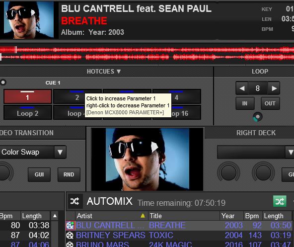
Noticed if you click on the bar above the pad section it gives the option to change pad param 1 and param 2 but it's not shown on the skin?
Also, can you please add an option to have the video panel above the deck section (below the waveform)
Thank you!

geposted Fri 03 Nov 17 @ 12:05 pm
kradcliffe wrote :
Les, I installed the PC version last night and it works fine.
Got it eventually, had to download it from the Mac side and transfer it across to the PC side.
Programmed a new Pad Page with my colouring system for new tracks. Used it this morning and works great.
Also reprogrammed the three Custom Buttons with smart_play, pitch_lock & pitch_reset. Great that they light up when in use. I already have key combinations to switch these on/off with my MC6000 MkII.
Lovin' the clean looks of this skin, gonna use it on my gig tonight. :-)
Cheers
Les
geposted Fri 03 Nov 17 @ 3:07 pm
Have you tried Loco's Rate'n'Colour Pad Page
geposted Fri 03 Nov 17 @ 9:06 pm
Yeh, had a look at it, but, I don't use the star rating system + I already have my own colour system thanks.
geposted Sat 04 Nov 17 @ 2:47 am
Did my first gig with this skin last night and it was a pleasure to use.
My only critique is that near the end of the night when I was starting to watch the time I found the clock digits a bit small.
My only critique is that near the end of the night when I was starting to watch the time I found the clock digits a bit small.
geposted Sat 04 Nov 17 @ 9:45 am
DJSoulman wrote :
I found the clock digits a bit small.
What if it was this size?
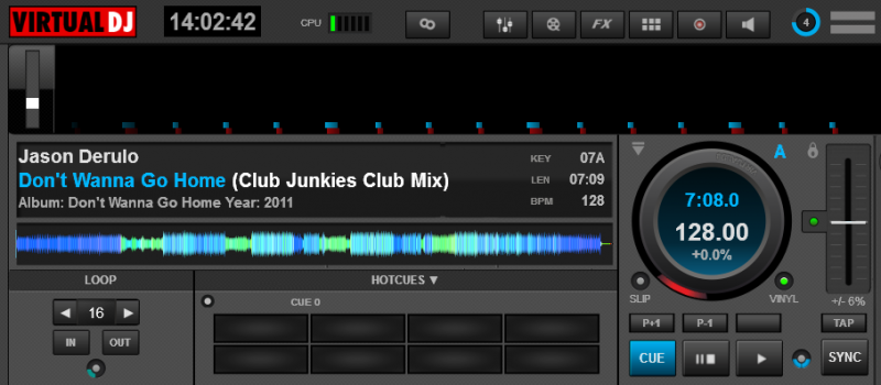
If that would be suitable, I can post the code here for you to modify the skin.
geposted Sat 04 Nov 17 @ 2:06 pm
thank you for this skin, I will put it to use today, I always love the skins that you make.....
geposted Sat 04 Nov 17 @ 3:51 pm
groovindj wrote :
What if it was this size?
If that would be suitable, I can post the code here for you to modify the skin.
What if it was this size?
If that would be suitable, I can post the code here for you to modify the skin.
That's very generous of you mista. I wear varifocal glasses, bottom bit is for reading top half is for distance. The browser text is a standard size which I can read fine through the distance part, but, the clock digits are smaller meaning I have to tilt my head back to read the time thru the bottom reading part of my glasses. Bit of a pain really (and probably looks daft to the punters lol).
Cheers
Les
geposted Sun 05 Nov 17 @ 2:34 am
I tried wearing those once. Horrible things!
So is that a yes?
So is that a yes?
geposted Sun 05 Nov 17 @ 8:00 am
Go on then, you've twisted my arm lol.
P.S. It's no better wearing my contact lenses. They are called 'Mono vision', the left eye is set for reading at arms length, the right eye is set for distance vision. The brain is clever enough to work it all out. I normally only use them when out running, glasses slop around too much when a bit sweaty. I can use them for DJing, but, again the characters onscreen have just a little bit of a blurry edge to them because the right eye is set for distance and can't focus. Also, in clubs & Hotels the air conditioning can play havoc with them after a few hours.
About 12 years ago I had some green sunglasses converted to purely reading glasses for DJing. Only used them a couple of times because, although they were great for DJing with a computer, the peoples faces on the dancefloor were just a blur and couldn't recognise anybody....... and I looked like a reject from LMFAO lol.
Should have got my eyes lasered years ago and could have saved me a fortune on glasses & contacts.
Cheers
Les
geposted Sun 05 Nov 17 @ 9:55 am
OK so you need to open up (in a text editor) the skin.xml that's inside blocks.zip, then look for the code that starts with <group name="clock"
Replace what's there with this:
If your text editor displays line numbers (like Notepad++) then it starts at 6165
Save the modified skin.xml back to blocks.zip and you're done.
Replace what's there with this:
<group name="clock" x="171" y="6">
    <visual type="color" source="constant 'black'">
      <pos x="+0" y="+0"/>
      <size width="100" height="32"/>
    </visual>
    <textzone>
      <pos x="+5" y="+1"/>
      <size width="90" height="30"/>
      <tooltip>CLOCK\n Click to toggle between 24hour clock and am/pm</tooltip>
      <text size="30" color="#aaaaaa" align="center" weight="bold" format="%fullhour"/>
	  <text2 size="30" color="#aaaaaa" align="center" weight="bold" format="%hour12"/>
      <text3 size="30" color="#aaaaaa" align="center" weight="bold" format="%counter"/>
    </textzone>
  </group>
If your text editor displays line numbers (like Notepad++) then it starts at 6165
Save the modified skin.xml back to blocks.zip and you're done.
geposted Sun 05 Nov 17 @ 10:20 am
Thanks groovindj
I tried that exactly as you said, but, found it a little too much. After lots and lots of trial and error I've managed to get the clock somewhere in between with a text size of 26, it looks about the same size as the text I'm using in the browser. Much easier to see now.
Thanks for all your help, it's much appreciated.
Cheers
Les
geposted Sun 05 Nov 17 @ 3:35 pm


